All of the Pro client apps have a common interface design. They comprise a ribbon panel at the top, status bar, (side) panels and a central workspace for content. When forms need to be presented to users for configuration or data entry, they usually open from the bottom or side panels.
Ribbons
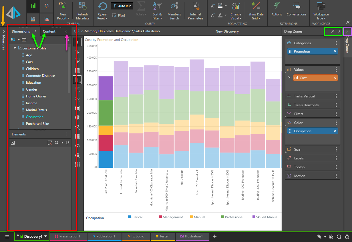
Within each module, the relevant ribbons appear along the top of the workspace. The ribbons can be minimized and maximized using the arrows on the right (red arrow). All ribbons include the large Run Query button (yellow), tabs (purple) for showing different ribbons, and the ribbon itself (blue). The ribbon tabs and content may change depending on the current selection.
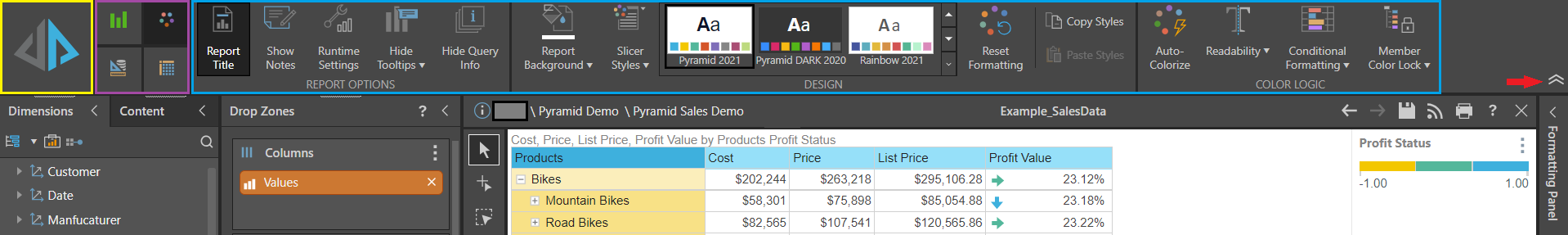
Run Query Button
The large Run Query or execute button appears in the upper-left corner of the workspace in each module (yellow box above), and has a different function for each module:
Note: Clicking F2 on a keyboard runs the same function as pushing the large run button.
- Model: Runs and processes the Data Flow and Data Model by opening the Processing Options dialog.
- Discover: Runs or executes the current query.
 If Auto Run is enabled, this button generally doesn't need to be clicked. When auto run is off, however, or certain selections are made, users need to click this button to execute the query. When required, it normally displays a lightning bolt icon.
- Present: Launches the current presentation, using the currently selected slide.
- Publish: Launches the Print dialog for the current publication allowing the user to create a manual rendering of the template.
- Illustrate: Runs the current illustration with the default values of data to drive any dynamic changes or text.
- Formulate: Generates a preview of the current formulation with the default values, showing the result in preview panel.
- When in script mode, clicking the execute button will test the script and show whether it is valid.
Ribbon Tabs
The ribbon tabs change based on the app and the context. There are scenarios where there are no tabs, two tabs, or four tabs. In some cases, the tab itself may change based on the selected item and context. Hovering over the tab will open a tooltip with a name for the tab.
Status Bar
The status bar (yellow below) appears in all apps. Its functions change slightly from one app to the next, however, there are several common elements to all or most apps:
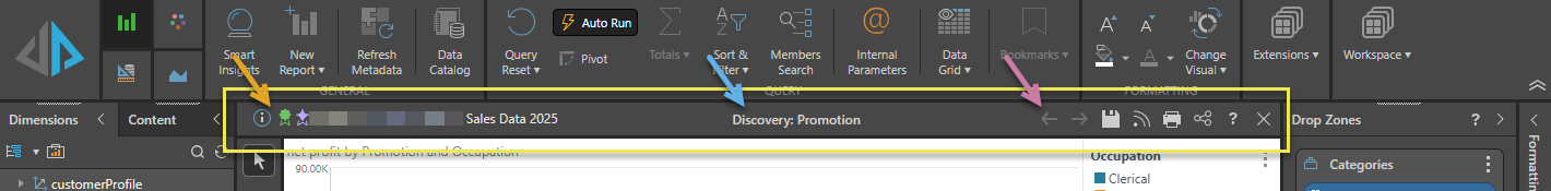
Content item details
The orange arrow points to the common content item details:
- The Metadata icon opens the Metadata panel.
- The Sanctioned and AI-generated icons indicate a Sanctioned Model or AI-Generated Data Source (where applicable).
- The text then indicates the location of the content item in the model.
Certified Data Source
 The Sanctioned certificate may appear in Discover, Formulate, or Present. This is a useful way to indicate to users which data models have been verified and reviewed.
AI-Generated
 The AI-Generated icon, which indicates that models might contain AI-generated data, appears alongside the model name and in the metadata when viewed at design time in Discover, Formulate, and Present. At runtime and in the Viewer, the same icon is used for publications and discoveries. For more information, see Identify AI-Generated Data Sources.
Title
The name of the content item (blue arrow).
Tools
The purple arrow below points to the tools that are typically available from the status bar:
- Undo / Redo (left and right arrows): Use the left and right arrows to undo and redo your changes. For more information, see Undo and Redo throughout the Client.
- Save (disk icon): Open the Save dialog and save the file. For more information, see Saving Content. The same function is available from the tab menu.
- Subscribe (broadcast icon): Share the item with selected users on a scheduled basis, typically by posting the selected item to the bulletin board or by sending a regular email. For more information, see Configure Subscriptions.
- Print (printer icon): Open the Print/Export dialog and print or export the file. For more information, see Printing.
- Share: Opens the Share Content dialog. You can share your artifact with other users (recipients), either by attaching the exported content to an email or by sending a Share Link to the recipient for access in Pyramid. For more information, see Share Content.
- Close (X): Close the currently open file. If your file has unsaved changes, you will be prompted to save them. For more information, see Closing Unsaved Items in Saving Content.
Printing
Printing also appears in some apps, but it has different functions:
- Model: Prints out the model flow summary document.
- Discover: Prints out the current report.
- Publish: Launches the "print-now" option to manually print the publication.
- Tabulate: Prints the Print Area or other Visual Areas from the tabulation.
The print button does not appear for the other apps:
- Present: The printing option is only available once the presentation is running.
- Formulate: Has no printing options.
- Illustrate: Has no printing options, because the illustrations are normally printed has part of presentations or publications.
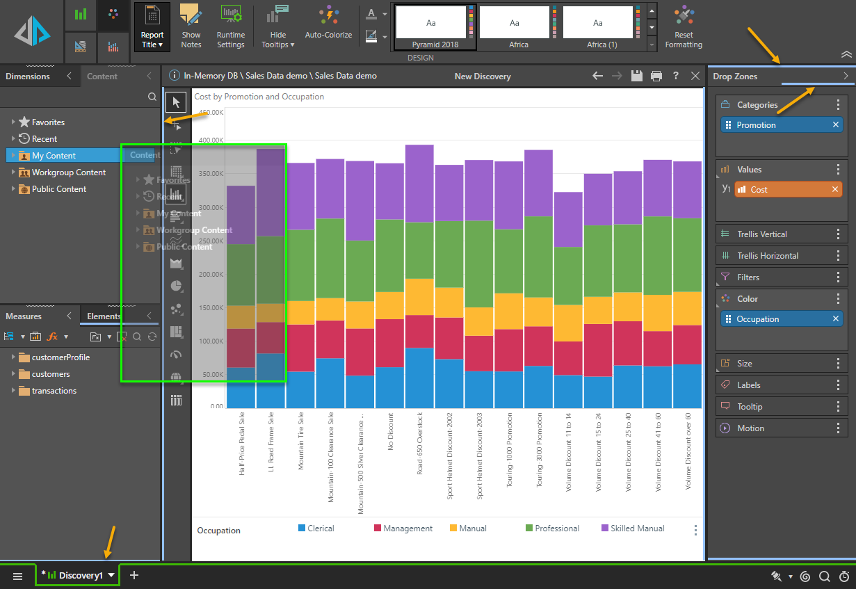
Panels
Each app has been designed with panels that are mostly presented on the sides of each app (red box below). The panels can appear side-by-side, stacked vertically, or tabbed (green arrows below). The workspace in each module is quite flexible, and users are able to minimize and maximize panels as required.
Sometimes, the panels are collapsed, and will show up a slim bars on the edges (yellow arrows below). Clicking the fly-out arrow for the panel (purple box) will expand the panel out without locking it in place. To lock it in place click the "pin" button (green box below). Clicking the arrows on a tab (pink arrow below) will collapse the panel.
Panel "Modularity"
The panels can also easily be dragged and dropped onto one of the various docking zones. To move a panel: hover over the panel heading, left-click and drag the panel. The panel becomes semi-transparent (green box below) and can be dropped into the docking zones, indicated with blue lines (orange arrows below).